UX writing and the Tale of the Exploding Pizza
January 2, 2015

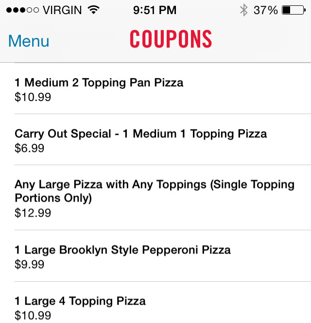
In a moment of hunger-induced laziness I turned to the Domino’s iPhone app. A large unlimited-topping pizza for $12.99? Sounds pretty good to me. I was hungry and dead set on getting the most value I could out of this thing.
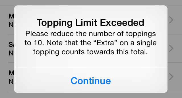
Turns out, as it often does, that unlimited actually wasn’t.

Why does this matter? I was well on my way — quickly moving down my path to purchase — to giving them money, and they interrupted me and made me think about something I didn’t intend to. I wasn’t upset, especially when I got the pizza and experienced the monstrosity I had created, feeling that my ten toppings* were actually quite generous. But, I was just thrown off mid-experience, and that’s not cool, ideally.
The reason things like this aren’t optimal is because it’s usually no one’s job, and it probably involves 2-3 ten-person meetings with a whole committee to make a decision. Though I’ll admit this is an extreme case, and you can’t test for every possible scenario. I’m bound to discover these things because, well, I’m an outlier and tend to push things in a direction no one intended them to go. Just because. Anyway, some things, as important as they are, might be best left to the right person to solve, with support from others as needed.
UX is more than usability. It encompasses how a person thinks and feels. What if the error message wasn’t such an “error” message, but said something like “Yo pizza friend! Our lovely hand-tossed pizzas can only handle ten toppings…trust us.”? That’s a little friendlier and more on-brand. They had two options: state a number of toppings and diminish the attractiveness of “unlimited”, or take the chance that no one will be ridiculous as me and try to add all the toppings.
*toppings: two kinds of pepperoni, salami, sausage, bacon, hot peppers, green olives, pineapple, onion, and it was in fact delicious.
Make the world a better place, starting with your own little corner world in whatever you do — subscribe to my blog via email today.