User experience trends in online forms
September 30, 2014
A few things I’ve noticed lately. These details are small, but whether it’s a usability improvement, or gives the user more confidence, it’s that much better of an experience.
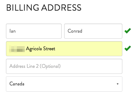
Friendly form validation

As you complete the billing form, checkmarks appear when you successfully fill in a field and move to the next. We’re so often reminded only of our form errors that this is a nice touch. It indicates that ur doin’ it rite, a good feeling to impart as people give you their money.
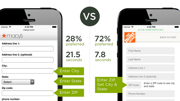
Entering zip code first informs city and state

Luke Wroblewski, usability research report.
Luke Wroblewski shared a user testing report for faster address collection that used a form with zip code first, which then grabs city and state, compared to the standard order of city, state, then zip. Not surprisingly it won in user preference and time to complete. Something like this could have international address issues, but testing on PostcodeAnywhere for fun worked for me in Canada (gets the street, too).
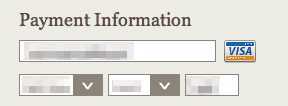
Auto-detect credit card type

Some websites show your credit card type once you enter your number. In past experience I’ve even had to select this, which made no sense to me since credit card numbers are unique. A small detail, but a tiny bit of extra reassurance that everything is going smoothly.
HTML5 form field types

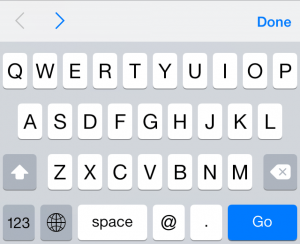
Smart keyboard for field type=email gives you the @
I shouldn’t be listing this as a trend in 2014, but it warrants a mention because it’s not as widespread as I’d expect. Specifically for mobile devices and tablets, different field types will do helpful things like show a different keyboard, for example:
- an email address field will have the @ symbol on the first screen
- in mobile Safari, using autocorrect= “off” on email and username fields means they won’t go autocorrect-crazy
- a number field will bring up only the number pad
These input types won’t even hurt old browsers, so there’s no reason not to do this. Here’s a whole list of mobile input types.
For more observations and other fun posts, subscribe by email.