10 awesome “About” pages that are probably better than yours
November 25, 2014
TL;DR
Your website’s “About” page is probably more important than you think. Check out the examples below and see what some companies have done that’s a cut above most. Whether they put in a lot of effort or just a bit extra, all these pages work harder than the bare minimum and are pages you actually might want to read. You can skip down to the numbered list now if you want.
“The ‘About Us’ page might as well be called the ‘can I trust you?’ page”– Chris Nodder, UX consultant
Why it matters
I used to think these were tossed onto a website because it was a thing you just did. Another case of “you are not the user” on my part. When I started looking into it, I noticed that “About” pages can actually get some traffic and generally command a position in the primary navigation, yet often they are designed as if no one looks at them. A recent study I ready by usability experts at the Nielsen Norman Group said that the “About” page is the second most viewed page on a university’s website.
Why would someone look at a website’s “About” page? To actually find out more about your company or what you do – seems legit. Maybe to check if you are credible, they’re considering between you and a competitor on their path to purchase and want to dig into the details, or they’re with the press or a blogger and want some key facts. It’s almost like a “continue reading our pitch here” page. Either way, people are looking. Check your stats and then check your page and ask yourself if it could be working harder. It’s a good spot for some bragging rights and more detailed content than you don’t want to jam onto your homepage, but still want to have somewhere for people that look for it. Again, just because I usually don’t, doesn’t mean visitors don’t.
These examples are from some of the biggest companies in their respective industries, but not all of their “About” pages are especially complicated. Some are beautiful, some aren’t, really. The common thread is that they took some time to get the content right, and did a good job presenting it. That is to say, nothing you couldn’t pull off.
1. Porter Airlines
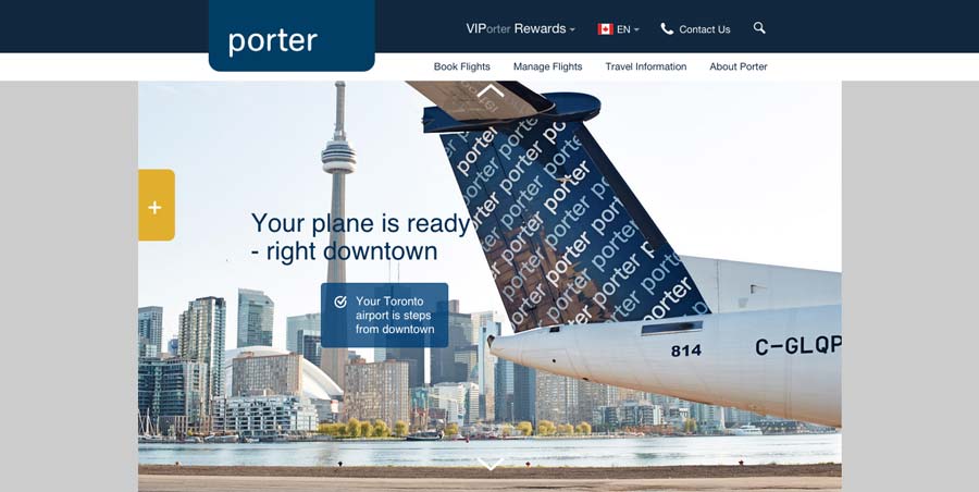
Porter gives you a rundown on why it’s so great. It’s a visually appealing, linear page with minimal text, but says all it needs to. You can dig deeper to more corporate stuff (like other airlines do), but I think the customer-centred approach is smart.
2. Freshbooks
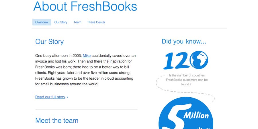
This is a good example of a page that’s not a ton of extra work but makes a definite improvement in experience. Simple, but the graphics stand out and helps the company feel that much more impressive.
3. Hubspot
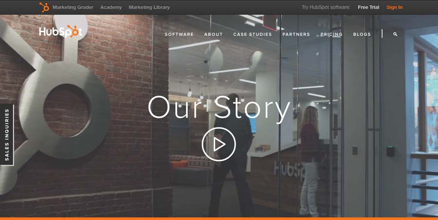
I had to fill out a lead gen. form just to see this awesome about page (kidding…or am I?). Hubspot has a long scrolling “About” page, beautifully designed featuring video and large, full-width images with reinforcing written copy and numbers. And while I’m sure Hubspot execs put SEO keywords in their kids’ Christmas stockings, they also managed to fit some into their URL.
4. Tumblr
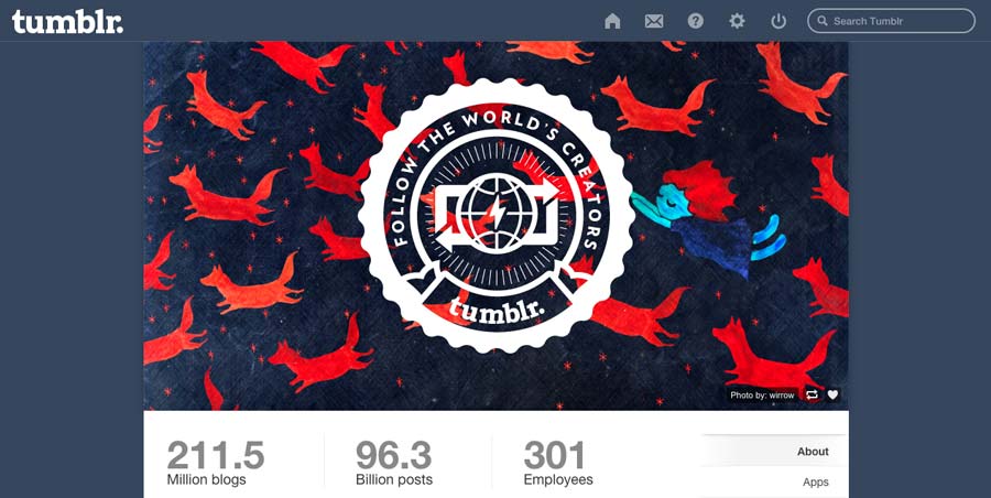
Tumblr has a rotating header background with some pretty trendy images and some large numbers, their latest staff Tumblr posts, and of course at least one animated gif.
5. Squarespace
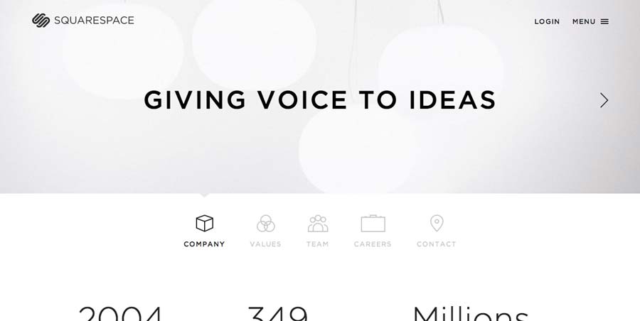
Squarespace’s “About” section is quite minimal and like Tumblr, uses some big numbers to express the size of their company (bigger than I thought), and a lot of artful photos of their office and staff. Actually, when you compare their numbers with Tumblr, they’re pretty similar… interesting.
6. MailChimp
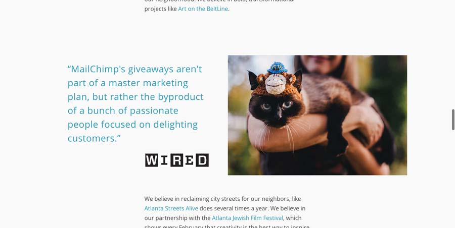
MailChimp is another long one. The “About” page of one of my favourite companies tells you all about the company and how they work, with quotes from Fast Company and Wired tossed in for cred. And I mean a cat wearing a knit monkey thing on its head? Damn.
7. Kickstarter
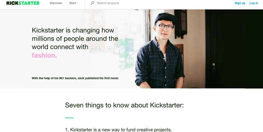
Kickstarter swaps photos on reload and rotates between different colored words of industries like fashion, publishing, and technology. The page is organized as a list of seven things to know – everybody likes lists.
8. Constant Contact
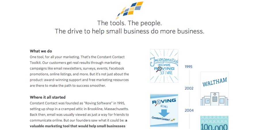
Quite similar to Freshbooks, this is another “this isn’t amazing but still probably better than yours, and there’s no reason you can’t have one too” “About” page.
9. Frank & Oak
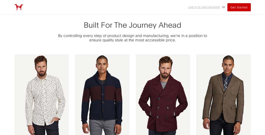
Frank and Oak’s homepage is essentially their “About” page, when you’re not logged in. It immediately talks about quality and differentiates themselves (wow, I don’t think I’ve said “differentiates” since university).
10. Rolex
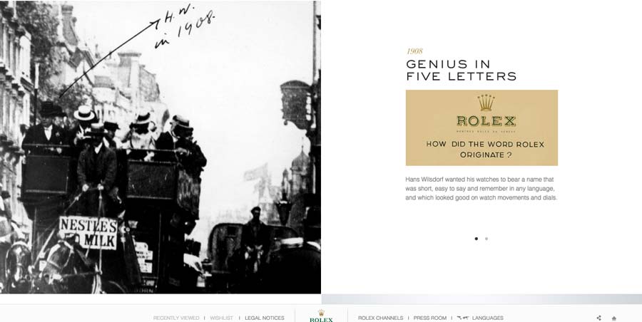
Rolex trumps all in terms of story. I was really surprised about this one. I wanted to look up a high profile fashion brand that could probably get away with giant photo of a hand wearing their watch giving the finger and people would still pay thousands for it (hey, they have some damn nice watches and I’d take one in a heartbeat if anyone’s feeling generous). Turns out they have a very prominent multi-page “About” section that tells the whole Rolex story, and I have to say I found it really interesting.
Anyway…
Most of these examples are startups or new-ish online business, that probably need to build credibility the most to establish themselves. I noticed that large, already established companies didn’t have much for about pages (Apple didn’t have one at all, of course). Others I checked out were Microsoft, Skype, Ebay, Walmart, and Louis Vuitton.