Watch-first design
April 4, 2016
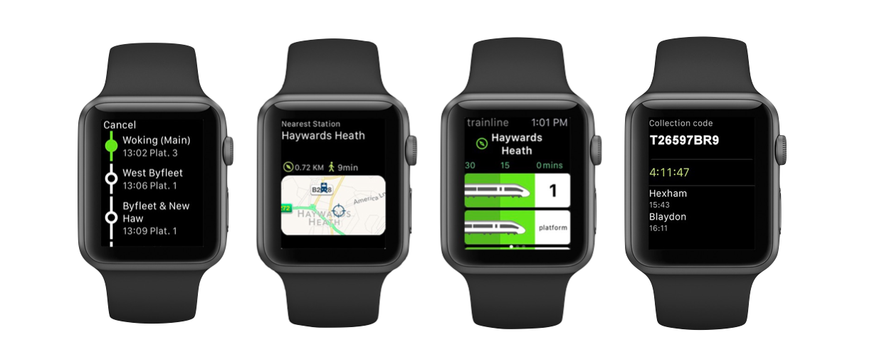
Image via Trainline.
When smartphones started to take off, we embraced responsive design. Then came mobile-first design. More than a tactic, it was a way of thinking – with less space, you have to make decisions on what’s the most important content and functionality. The bigger screen shouldn’t be a huge departure, maintaining those priorities and shifting what’s necessary while you resist the urge to add more only because there’s more space.
Take it a step further and try a watch-first design. It’s fun to think about because the watch is a shiny new thing, but challenging because it forces you to cut to the core content and functionality even more. What’s happening before and what happens after? It’s so linear it hurts. There’s no room for extra junk.
Mobile-first is practical, where watch-first is more of an exercise in focusing on singular user or task flows. On a watch you’d move from screen to screen for nearly every little thing. A constraint like this shines light on these micro moments and may help with storyboarding the experience.
It becomes less about what you can fit onto a tiny screen and more about thinking like a user in their journey to getting to what they want. Use the tiny screen to check your thoughts.
I remember working on website years ago and thinking “What if this was phone?”, now sometimes I like to ask myself “what if this was a watch?”. You, too, can be that pain-in-the-ass on your team.